Philadelphia Flyers: Ranking the top five jerseys in team history

(Photo by Kirk Irwin/Getty Images)
3 of 5
Next

The Philadelphia Flyers have a long jersey history. Cutting things down to the top five was a tough task.

Since they debuted back in 1967, the Philadelphia Flyers have gone through 19 different changes to their uniforms. That has included simple things such as nameplates and outlines. There have also been jerseys added such as the black jersey introduced back in 1997.

A full history of the Flyers jerseys can be found at the NHL Uniform Database’s website. But without further ado, here are some of the best jerseys the Flyers have worn throughout their long history.

(Photo by Kirk Irwin/Getty Images)
(Photo by Kirk Irwin/Getty Images) /

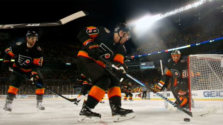
5. 2017 Stadiums Series

The only Black uniforms on this list, I like this uniform. This jersey was worn during the 2017 Stadium series against the Pittsburgh Penguins. The jersey itself is clean; however, it is best when paired with the black pants and black socks with a thick orange line going through it. We don’t see a lot of black in any of the other Flyer uniforms, so it is a nice change of pace.

With the whole uniform setup being predominantly black, any orange pops off the jersey. I think the other black uniforms the Flyers have worn in the past didn’t meet expectations. This jersey made its debut in 2017, but it wasn’t the only time the team would wear them. The Flyers would go on to use this as their alternate in the following two seasons, most recently sporting them this past season.

John LeClair, Philadelphia Flyers (Mandatory Credit: Robert Laberge /Allsport)
John LeClair, Philadelphia Flyers (Mandatory Credit: Robert Laberge /Allsport) /

4. 1984 White Jerseys

This next jersey was essentially worn as the primary white from 1984-2007 and for good reason. This design is really simple and clean. What I love most about these jerseys is that at least the jersey itself is not dominated by white. I think with some exceptions, the white jersey in hockey can be very boring, but the Flyers did well here with a dominant segment of orange from the collar down to the elbows. This portion was complemented with black trim and white numbers.

The pants were simply just black while the socks just consisted of two black stripes above and below a thicker block of orange in the middle. This jersey spreads out all three Flyers colors and isn’t anything too fancy. The orange, black, and white mix screams traditional Flyers as well as the Legion of Doom. While I am not a fan of white jerseys, these are nice.

3. 1984 Orange Jerseys

Lindsay Carson, Philadelphia Flyers (Photo by Graig Abel Collection/Getty Images)
Lindsay Carson, Philadelphia Flyers (Photo by Graig Abel Collection/Getty Images) /

The next Uniform is the Flyers orange from 1984-2001. These jerseys were replaced by the 2002 blacks. Like the last white, this uniform also screams legion of doom. The orange in this uniform is much richer than the more vibrant color used today. Not to mention it dominants both the look and the entirety of the uniform. The white strip running from the collar to the elbow is again outlined by a bold black with an orange stripe added right before the black meets the white at the elbow.

The numbers also pop out with its black trim and orange filling. Again, very simple black pants, yet the socks are an integral part of the uniform. Virtually all orange except for two black lines and a thick white block in the middle. I feel as though the first thing you notice about this uniform his how the white and black contrast the uniform.
Phil Myre and Behn Wilson, Philadelphia Flyers (Photo by Graig Abel/Getty Images)
Phil Myre and Behn Wilson, Philadelphia Flyers (Photo by Graig Abel/Getty Images) /

2. 1977 Orange Jerseys

Essentially the same uniform the Flyers wear today with some tweaks. It is also extremely similar to the uniform the Flyers wore during their Stanley Cup victories except for the names on the back of the uniforms. A predominantly orange uniform with a cut of white joining the front and back part of the uniforms. The numbers are more thickly bolded than they are today and the orange is darker or less vibrant.

The name on the back is also filled in with white as opposed to the white nameplate and black letters we see today. Besides how the white is filled in, it is very similar to today’s uniform. Ultimately, I like the style, color, how the name is done in this one.

Danny Briere, Philadelphia Flyers (Photo by Bruce Bennett/Getty Images)
Danny Briere, Philadelphia Flyers (Photo by Bruce Bennett/Getty Images) /

1. 2012 Winter Classic Jerseys

There are so many things I love with this 2012 Winter Classic jersey. Everything is super clean but perhaps what I love most is the implementation of the cream instead of the basic white. The cream compliments the black and white in a very refreshing way we have never seen in a Flyers uniform. The orange in this uniform seems to mix the old darker orange with today’s vibrant orange as well for a perfect combination.

The solid orange stripe lining the pants adds a touch to the traditional plain black pants while the style of the socks throws it back to that of the 1980s with of course the exception of the cream color. The black along the top of the jersey provides a nice contrast while not taking away from the jersey. It is the perfect amount of black to keep the jersey predominantly orange.

Lastly, while subtle, the keystone that holds the designated letter for the captains is such a creative but beautiful design. It pays homage to the state all the while making the jersey look even better and showing off the unique cream color.

Comment below and let us know your favorite jerseys!

Next