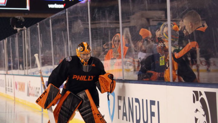
Now that the Flyers playoffs hopes are officially over, there’s not much to look forward to until next season. One of the only positive things to come out of the NHL this year, at least for Flyers fans, is the NHL’s Reverse Retro jerseys. This is something that the NHL should continue doing, but not so much so that they turn into the NBA, where teams who get two new uniforms every year.
Maybe two or three years from now the Flyers can consider some of these concept jerseys from around the web!
Jersey 1: Philadelphia Blazers Jersey
Grade: A
@cd24_design did an amazing job with this jersey. They made the Blazers old logo fit into a Flyers script, it’s perfect. This would be a great way to honor Flyers legend Bernie Parent who played for the Blazers in 1971-1972. It will be the 50th anniversary of that team next season. My only criticism of this jersey is that it should be orange with the Flyers logo written out in black or white. The Blazers jerseys were red and yellow, but overall this is an amazing jersey that they could wear with orange gloves. Make sure you scroll over on the pictures @cd24_design put in there to see the full logo and the original Blazers jerseys.
Jersey 2: Philadelphia Quakers Jersey
Grade: A+
Remember when the Flyers almost wore the orange Quakers throwbacks for the 2012 Winter Classic and then didn’t? This is the same concept just with the colors flipped. I love the two orange logos on the shoulders and the bell inside the collar is a nice touch, but the script that the Flyers is written in is beautiful. This jersey is sharp and I need to see it on the ice now! Good job @_puckdesigns
Jersey 3: Orange… Orange… and more Orange
Grade: C+
This jersey just has a little too much orange, but I like the idea of an orange helmet and gloves. I think if they Flyers wore that with a black jersey and black socks, it would look great! However this jersey kind of just looks like our players escaped from prison.
Jersey 4: The Liberty Bell Jerseys
Grade: B
Another good design by @cd24_design here. I love the idea of the Liberty Bell crack on the bottom of the jersey, but it’s a little hard to see on the black jersey. Also, the crack should be moved to the left side of the jersey to more accurately depict where the crack on the Liberty Bell is. The last jersey in here brings back the cream color, which I’m not a huge fan of. Overall, I think all three jerseys need a shoulder patch of some kind, other than that, pretty good.
Jersey 5: A Fade?
Grade: F
This is the ugliest Flyers jersey I have ever seen. Faded colors on any type of jersey doesn’t work. The script looks like a baseball jersey, it needs to be written more like the Rangers jersey if you’re going to use that logo (which you shouldn’t because the Flyers don’t use it anymore). Last, but certainly not least, what are the two little logos on the collar? This jersey is all over the place, sorry @mbhjerseydesign some of the other jerseys on your page are a lot better!
Jersey 6: The Practice Jerseys
Grade: A-
A few small tweaks would bring this up to an A++, but these jerseys were sweet when the Flyers wore them as the prepared for the only outdoor game they would ever win. The Philly font is awesome and it looks ok written across the chest. Personally, I would do a Rangers type thing because that just looks good on hockey jerseys, but a stripe or two on the bottom could prevent that. There also needs to be some sort of stripes on the sleeves and the original winged P logo on the shoulders. Finally, the script on the back for names and numbers would be sweet if they could match it up with the Philly on the front!

Which one do you think the Flyers should start wearing?
