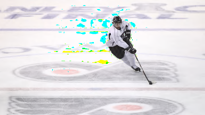
The Philadelphia Flyers have been embarking on a self-proclaimed “New Era of Orange.” They’ve done more than a few things to show the fanbase that they care and are listening. While bringing in new traditions, the organization is still keeping a nod to the past.
Not only have they brought back well-loved faces such as John Leclair and Patrick Sharp to help turn things around, they’ve also brought back the burnt orange look on the uniforms as well. They made another change that has fans taking notice. As teams have begun to return to their respective cities, arenas have begun the process of filling the rinks back up with ice. That comes with re-lining the ice and adding logos back to center ice. In doing so, the Flyers brought back a classic look to their center ice.
As seen in a video posted to their social media accounts, the double logo has returned. It was something that Ed Snider strongly preferred. He did not like having the logo split up by the red line. The Flyers moved away from the double logo ahead of the 2019-20 as they went with the full size logo, matching the rest of the NHL. They have brought the longtime tradition back with this move.
Resurfacing tradition. pic.twitter.com/VRHRW5xr4C
— Philadelphia Flyers (@NHLFlyers) September 13, 2023
For an organization that has fully committed to rebuilding and gaining back the fans trust, this is a small move in the grand scheme of things. The logo at center ice won’t help the team move back into contention. But what it does do is show that the current brass understands the traditions that were once a part of this organization. It shows that they are more than willing to change when they were so resistant to in the past. It means more than just a part of the ice. This might be a new era, but that doesn’t mean that the past has to be completely forgotten about.
