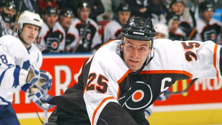
The new era of Orange is upon us as Danny Briere and Keith Jones try to rebuild the Flyers team. However, it is also time to go back to black.
If you grew up as a Flyers fan in the '90s and '2000s, you were blessed with a simple, yet awesome black jersey. It had a stark contrast between the white and black portions, subtle orange piping that enhanced the letters and borders, and made each player look just a little bit meaner and more intimidating.
My guy Johnny Ulecka has been on X for over a month asking for the black jerseys back.
Day 33 of tweeting the @NHLFlyers until we get the old black jerseys back! #BringThemBack pic.twitter.com/zt6dg2IWpU
— Johnny Ulecka | AATBirds (@Johnnyu9322) July 26, 2025
These are classics, but are best fit to the former NHL jersey designs, which were a little more boxy and a little less form-fitting than the current models.
The Flyers had black jerseys from 1997 until the 2010-11 season. Then they popped back up as a special edition for the Stadium Series and have stuck around since.

They also have the Reverse Retro jersey. While both were fine, neither were a black jersey.
They're great. They are easier on the eyes than the all-orange versions that came later, and while the white Stadium Series jerseys were good, the Flyers current white jerseys are classic and are one of the few NHL jerseys that can't be improved on.
Now, these jerseys and color scheme deserve reverence. Our guy Todd Matthews says so. He isn't wrong. Try thinking of another franchise that hasn't had any major redesigns at all.
These black ones, though, can be punched up. There isn't enough balance between the black and white, and it also lacks some orange. Without any extra piping, they also lose a bit of shape.
To improve this jersey, you need a little more white. The bottom strip needs to have some white; there needs to be extra orange and white piping, and the logo has to remain the same! That is the key rule in all Flyers jersey redesigns: the logo has to remain the same.
This was the rule that the overhated mid-2000s orange 3D jerseys made.

The orange dot is too small, and the silver trim just doesn't work. The sleeves are also oddly laid out. Pay no attention to Hatcher's atrocious Mission bucket and disastrous sock tuck.
Now, I'm no artist, but thanks to AI, I don't have to be. With the help of ChatGPT, I've come up with two versions for you to feast your eyes on.
I've been trying to do a small redesign of the @NHLFlyers jersey using ChatGPT. They come out a little like practice jerseys, but I like the scheme so far. It's a fun way to play with this new AI toy. pic.twitter.com/hhnzjOwazc
— Matthew Maratea (@MatthewMaratea) July 29, 2025
You've gotta click the image for the full picture, but it is a mostly black jersey, with orange and white piping, a white armband around the elbow, and some extra bordering around the bottom. The most "controversial" part of the redesign would be the slight tilt on the Flyers logo, a la the winged wheel of the Detroit Red Wings logo.
Then there is the 80s-inspired second option.
The '80s one looks better? Or maybe it's just the hair and sepia tone? Nah, the hair. 100% the hair. pic.twitter.com/nFNxSZDXPZ
— Matthew Maratea (@MatthewMaratea) July 29, 2025
Again, click the link for the full picture, but this has white shoulders moving down the sleeve and an orange arm band cut off, moving onto a black forearm. With the white shoulder, the piping goes away.
Either way, both of these options are trying to stay true to the beauty of the Flyers jersey and color scheme, while changing just enough to make an actual impact to the Flyers look.
Let us know what you think!
